America Competes 2020
Branding & Editorial Design
Amid increasingly fractured and partisan policy debates, the annual research campaign at the Center for a New American Security is focused on improving American competitiveness at home and abroad. Throughout the year the campaign will feature research, publications, events, and multimedia aimed to help renew America’s strategic advantages.
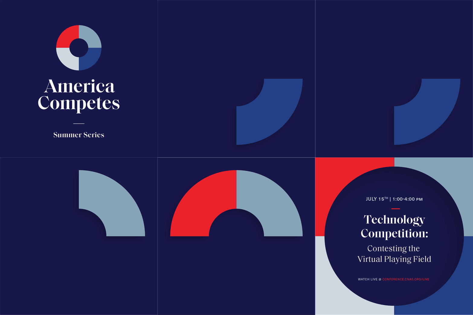
As I explored visual concepts for a competition-themed brand, things like games, puzzles, and scores naturally came to mind. I was also influenced by the idea of the future and how our actions now will impact our position in the world tomorrow. To that end, imagery like portals, cameras, and view finders inspired me. When considering typography for the project, I wanted something classic, but with a little edginess, and found the font Saol Display by Schick Toikka has interesting calligraphic features with some unexpected finishes. The type’s aesthetic conveys a lasting confidence that isn’t too dominant. The main logomark is based on the game piece found in one of the most classic American board games—Trivial Pursuit. The wedges in the pie can be used as a container for imagery specific to different research initiatives and customized for each project. The color palette includes the main brand colors plus a dark navy blue to add a bit of sobriety and depth.
CREDITS
My Role: Design and creative direction
Web Design and Development: Savas Labs


