

WestExec Advisors
BRANDING
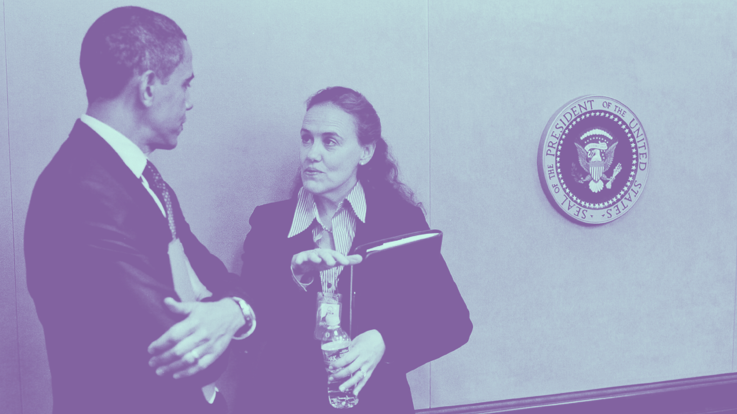
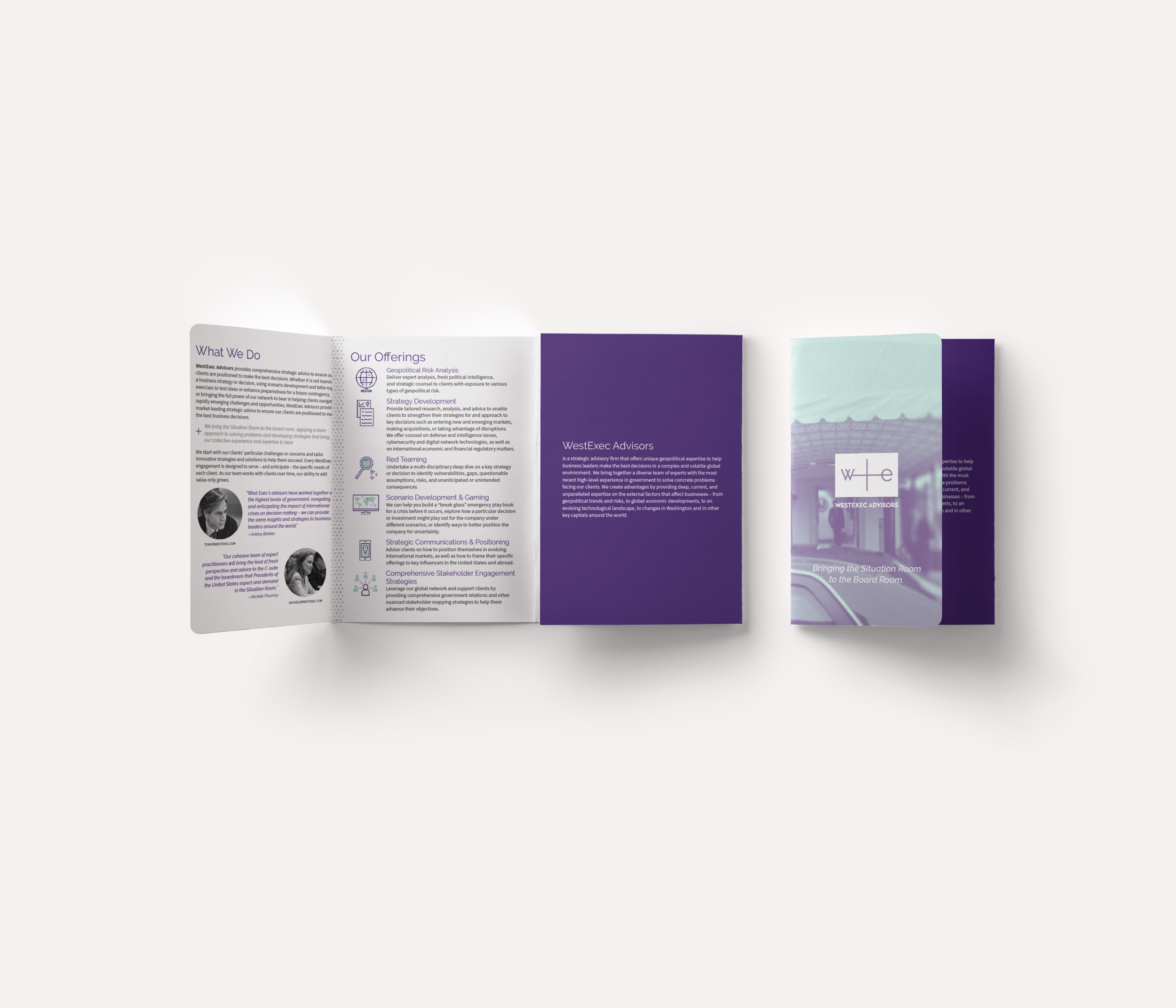
A new Washington, D.C.-based consulting firm reached out to me to design their branding and identity system. The name of the company, WestExec Advisors, is inspired by “West Executive Avenue,” which is the closed street that runs between the West Wing of the White House and the Eisenhower Executive Office Building. In other words, the street where people working for the President of the United States cross to have meetings with him and his national security team!

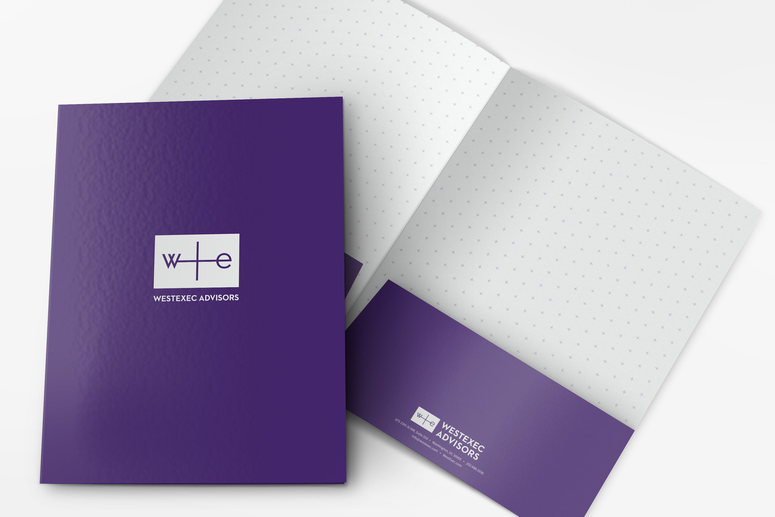
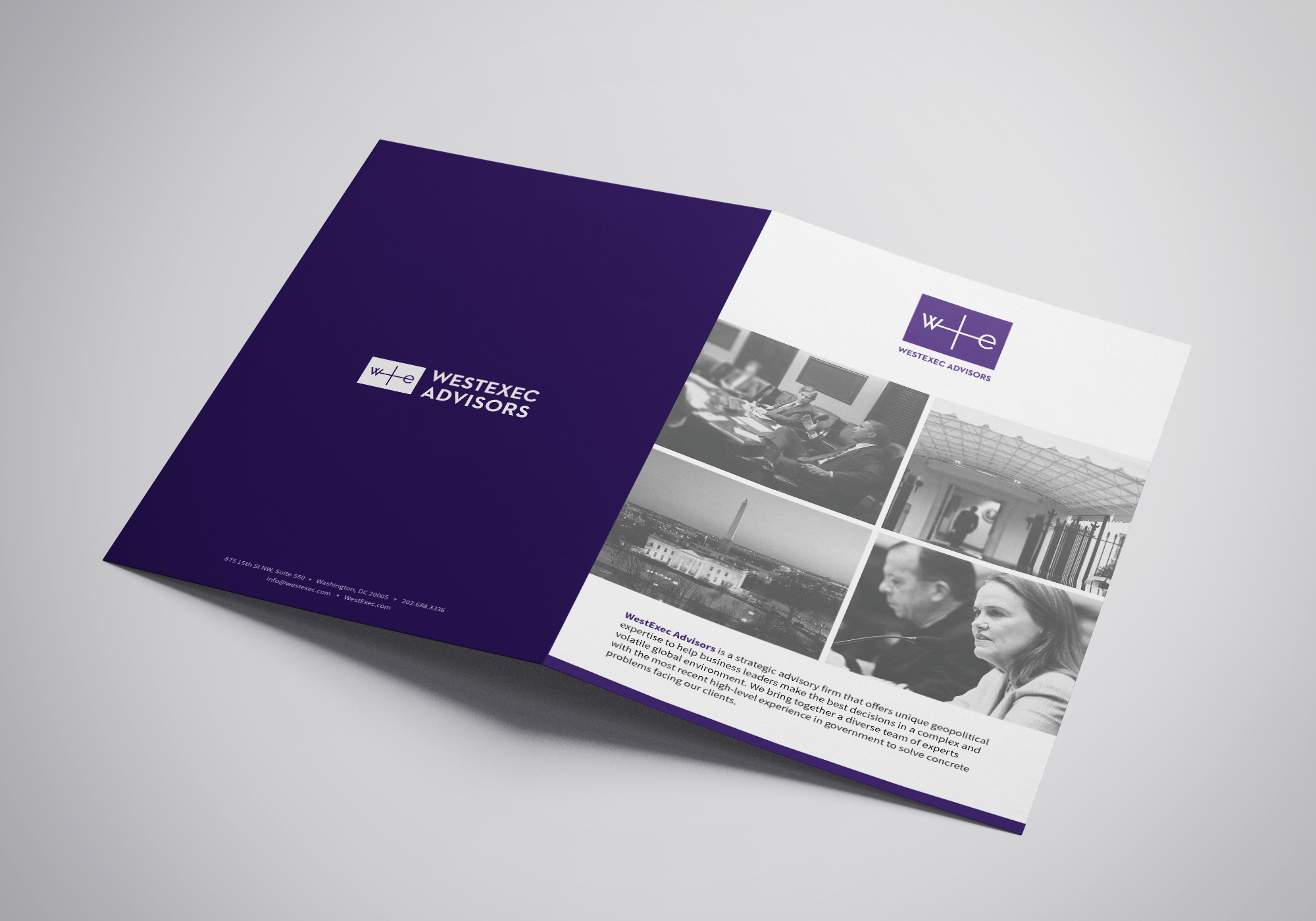
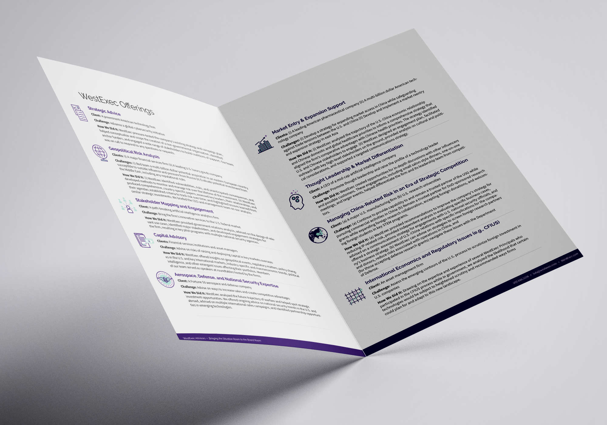
After a series of brainstorming sessions, we landed on navigation and wayfinding symbols as inspirations for the branding mark—as the firm’s goal is to provide clients with strategic direction. We further integrated the W and E in the mark to introduce both the idea of connecting west and east and “we.” After looking at other brands in the consulting space, we chose purple as a distinctive color palette; in the Department of Defense the color also means “joint.” Since the employees are the focal point in this industry, we created a headshot style that is modern in appearance, friendly, and accessible.


CREDITS
My role: lead designer and creative direction
Website design & development: Andrew Curtis
Headshot photography: Erin Scott