
CNAS Brand ReDesign
BRANDING & Editorial design
The Center for a New American Security (CNAS) is a small, bipartisan think tank that researches issues related to national security and defense. The organization prides itself on being a place where researchers can make bold policy recommendations and where the next generation of national leaders can come, learn, and publish.
I am CNAS’s first in-house graphic designer. When the company was launched they had hired a branding firm to develop their identity system, but no one had been managing the brand internally. As a result, collateral materials were inconsistent, the brand looked dated, and, overall, it didn’t match my impression of the organization when I joined. As I got familiar with the organization and earned leadership support, I set out to refresh our brand and update the printed, digital, and environmental spaces.
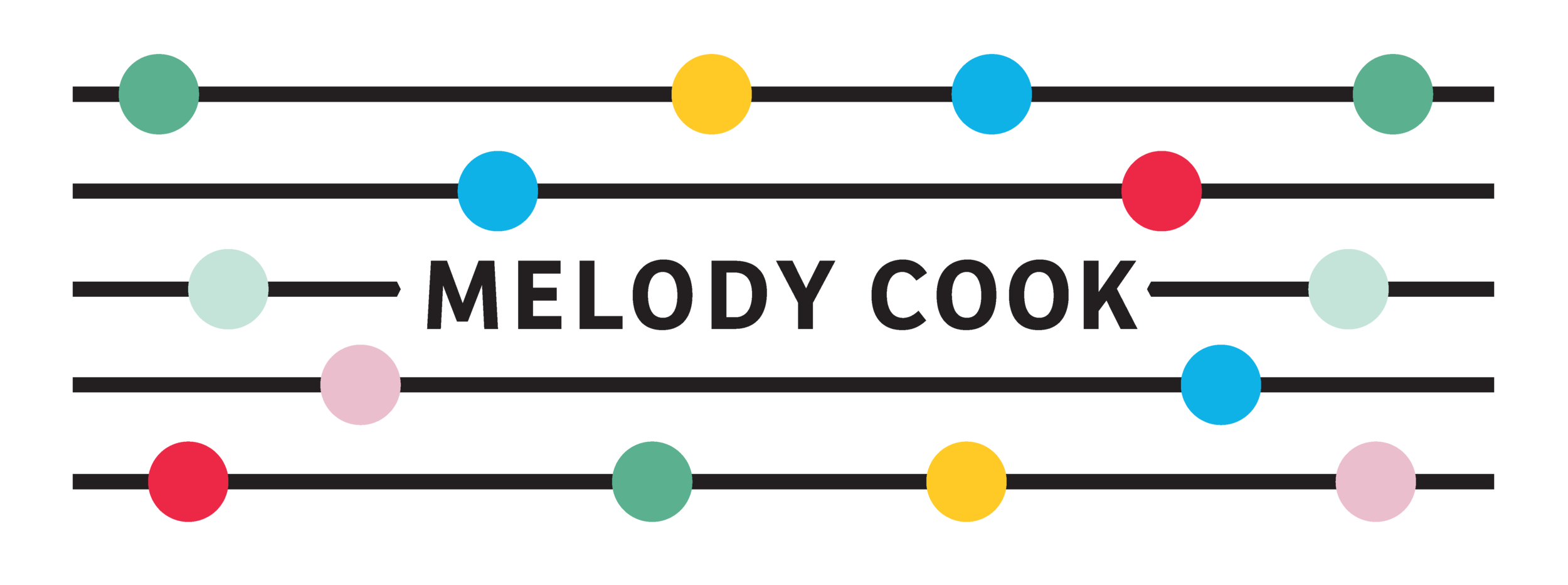
Logo Before and After
The logo mark is the shape of a shield with a curved line that runs down the front—symbolizing the Center’s work in defense and its bipartisan stature. We wanted to make the mark more current and optimized for web. We simplified the weight of the curved stroke; removed the shadow of the shield, which was unnoticeable at mobile size; found a taller, more compressed font to work with the organization’s long name; and reversed the color application, enabling the logotype to be a single color and to feel more unified with the logomark.
Acronym and Sub-Brand Example
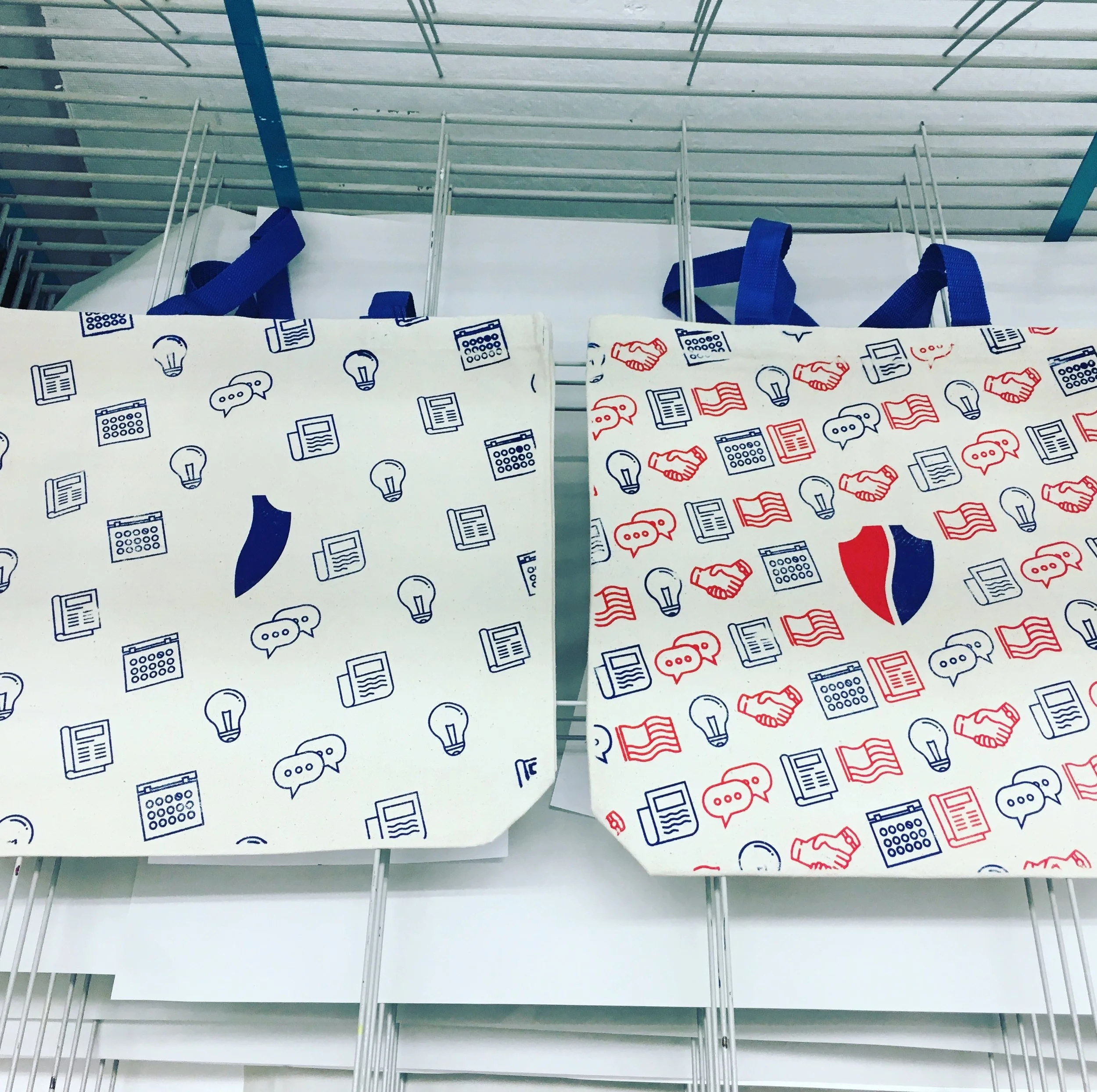
Instead of keeping the more subdued and traditional American flag hues, we brightened the red and blue and started using about 60-70% white in design compositions as a way to brighten and modernize. Red, the more dominant color in our palette, started playing a more strategic role as an active link on our website or a call to action in a printed brochure.


CNAS Report Before and After
Since we use mostly editorial stock photography in our materials, we wanted to find a way to make the imagery feel more bespoke, custom, and artistic. We opted to desaturate all the images on our website and use a blue tint on some images in marketing materials and other products to keep them looking cohesive no matter where or when the image was shot. With our people and their ideas the focal point of the organization, we also reimagined the corporate headshot.
Cover Variations


CNAS Website Before and After
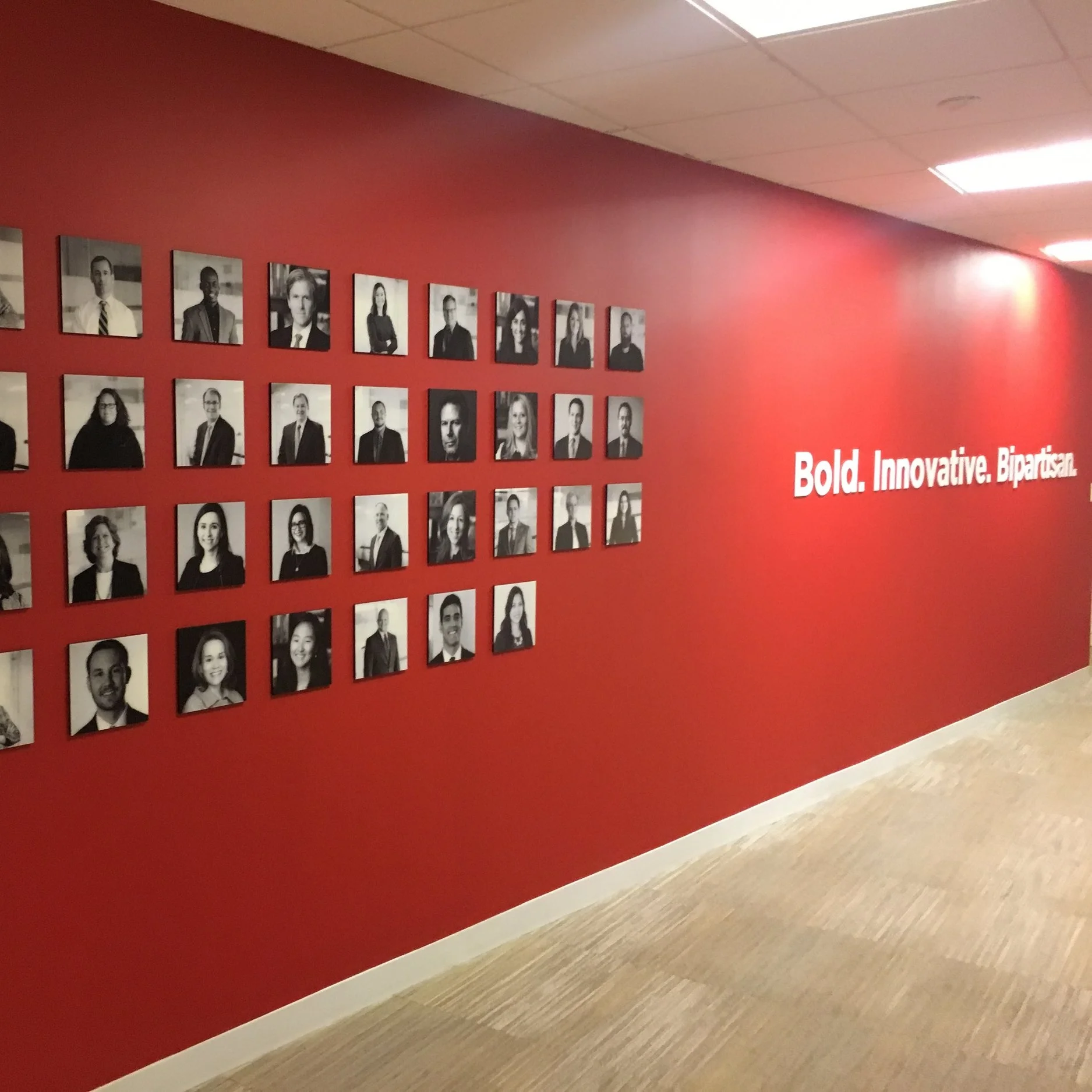
The more changes we made to our printed and digital materials, the more quickly we realized that our office space was in desperate need of a refresh and a little brand personality. We executed a complete redesign of our conference rooms, selected carpet and furniture, and added new signs and artwork to the reception and collaborative spaces.
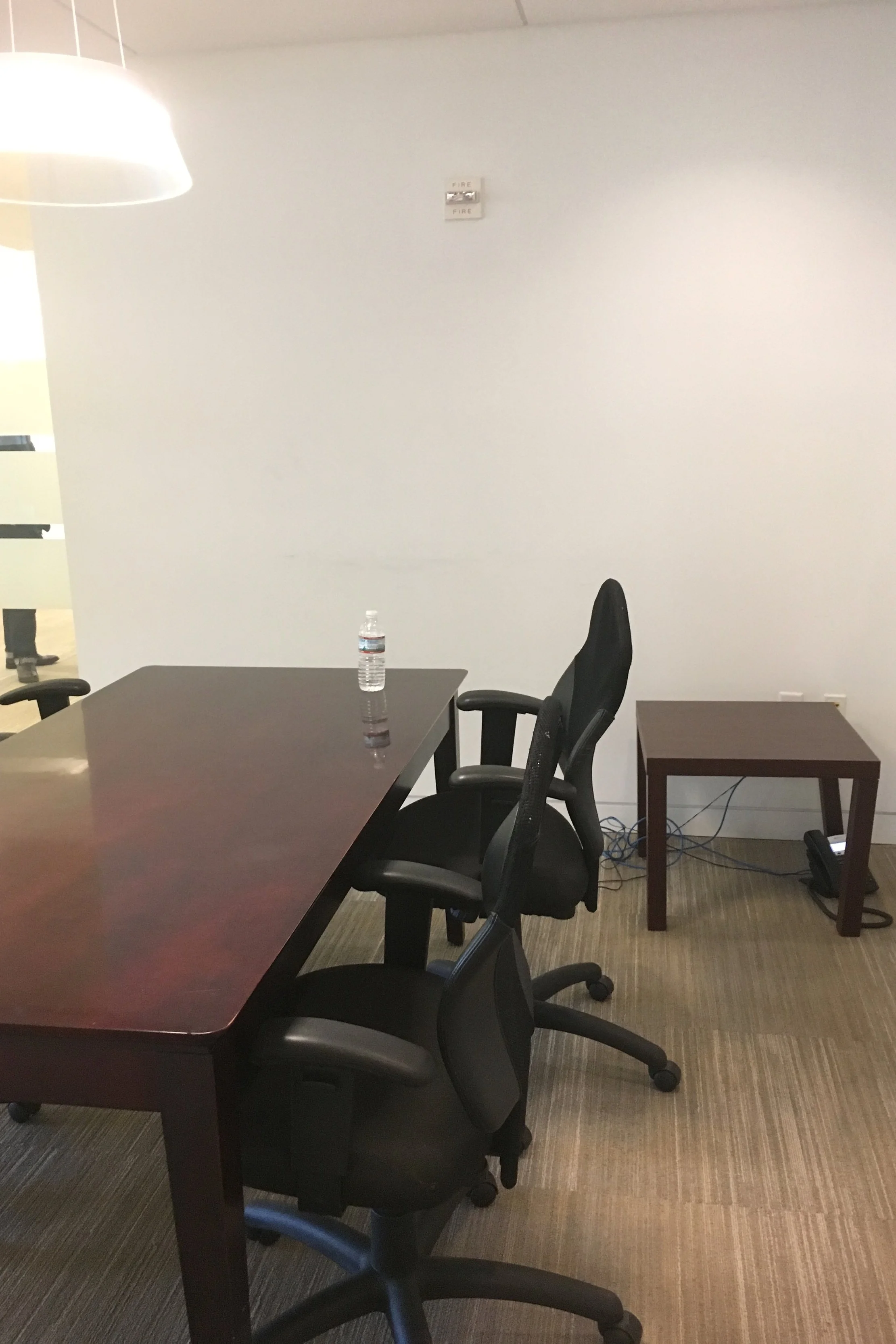

Office space before and after


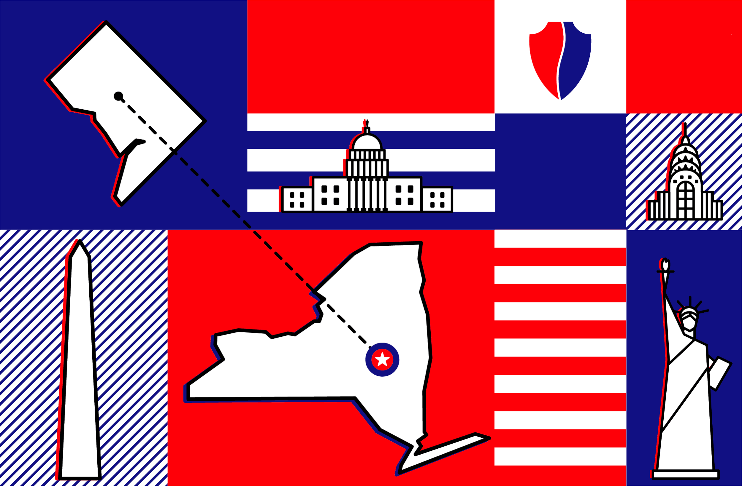
Email hero image for NY based event
credits
My Role: Design and creative direction
Graphic Design: Erin Rothback and Tristan Campos
Photography: Erin Scott
Web Design and Development: Viget
Interior Design: Unispace